Guide for the web designer for Vision4k
https://designer.breecesystem.com
or by right clicking the design in Cloud > Show versions
right click desired version > Open in webdesigner


Login:
After accessing the URL the user is met with the login page
User will add username credentials and click “Get started”

The system will now try the combination of the username and password on the various cloud systems:
(Delfi own and private clouds)
- DEMO
- Prod1
- Prod2
- …
Login step2:
After checking accessibility on the various systems the user now gets a list of the systems the user has access to.

 If the user has been logged on before then the user needs to state if he/she wants to continue the last session or start over.
the User will select system, installation group (this can be skipped), installation.
The user now needs to either open the existing design from the cloud or from local storage or create a new design.
When opening an existing design from the cloud – version must also be selected.

Create new (Package name is optional):

Open existing (User needs to select a local JSON file (design file) or BDM file

Entering the Editor (overview)
Overview:

Create Elements bar: Create various elements by clicking and draw in the canvas area.
Quick properties bar: Change to most common properties here
Elements list: List of the elements added to the design. “Hide” elements by clicking the small “eye” to easily reach other elements in the canvas area.
Element properties area: Here all the properties of the single element can be changed
Preview: After adding elements to the canvas area it is possible to see what it would look like with product data.
Upload to cloud: By entering the menu it is possible to upload the design to the cloud and make it work on V4K.
Assignment Slot list: Here the user can create and edit assignment slots. Assignment slot is input from the user upon assign to the V4K.
Create/edit slideshow: Here the user can set up and edit the slideshow. When making a slide show the user set up the design to match the first slide. In the slide show editor, the user will configure the rest of the slides.
Upload to the cloud:
Here can download the keyframe file (BDM file) to local storage.
Upload the design and keyframe file to installation.
Upload the design and keyframe file to the installation group.

The user can choose to publish upon upload.

Preview: Use the preview button to see how the design will look with data on V4K.
 File -> Save (Top left) Change the language top right

Stretch and align an element (above Canvas area):


Moving an element using the arrow buttons in the element properties:
To easily move an element pixel by pixel, use the arrows on the right side in the element properties under position & size:

Creating/editing Assignment slots:
Assignment slots are the fields where user input is expected upon assignment.
E.g. the user can determine which product should be shown.
There are different types of assignment slots (Types help define what the given text input is) – used for different purposes.
 Parameter: Parameter is a variable to be used within the design. Either to be shown directly e.g. text value or to use in slideshow e.g. the interval.
Product: Product number
Video: Video URL, or filename
Image: Image URL, or filename
Used with Breece Smart Queue only
Queue: Queue variable from cloud
QueueHist: A queue history position (1,2,3…)
Cashier: Cashier input from cloud
It is possible to configure - if the input should be required upon assignment or not.
Use the small + to clone assignment slots if many of the same types is to be created.
The order here determines the order shown when assigning the vision4k.
Elements
 Rectangle
Make a rectangle and change color fill and/or border color and width.
Use the advanced properties to e.g. use a parameter input to determine the color of the rectangle.
QRcode 
Make a 2D QR-code assign a product variable or make a static value (e.g. website)

Barcode 
Make 2D barcode. When making a barcode user needs to determine the type of barcode (symbologies) to be used:

Line
Draw a straight line
 Text
Text
Write a static text (Manual) or use product input or user input (parameter).
Image 
Show image. Use the Advanced values option the make a dynamic configuration of the image name to be retrieved when shown.

Video 
 Video element. Use the predefined formats to easily set the ratio between the height and width of the video element to match the input video.
If size should be adjusted afterward – click the  button. Now the size is easily changed without changing the ratio.
Use the Fade-in/out animation for smoother transition when video loops. Configure the right color

![]() Webview
Webview
Webview is to be able to show webpage or stream movies via webview. Use a parameter to make dynamic input or static (manual):

(Grid) 
Use the grid function (table) to make it easy to make several sections that are configured the same way.
It is possible to turn off grid coordinates (so these are skipped – if they should not be used).
To add elements to the grid the element should be inside the (1,1) top left the coordinate area. Right-click the elements and select add to table. The element will automatically be copied to all coordinates and if the product variable is input then the assignment slot assigned value will be changed in the same order as made when making the assignment slots.
e.g. if a text showing the price of assignment slot: Product1 and this is added to the table. Then grid coordinate will show the price of the next product in the assignments slot list – Product2.
If the condition has been made the user can configure if this also should be changed coordinate by coordinate or keep the same condition for all coordinates.
Apply properties in grid
If a change is made to any element in the grid, it is possible to apply this change to all other similar elements in the grid. Right click the element in the list > Apply properties.
The element properties will now be changed accordingly in all other grids.

Turning off grid (grid will be skipped when adding elements to table)
To deactivate a grid in a table, click the "eye" icon to the left of the grid name in the elements list.
When adding elements to the table, any deactivated grids will be skipped and the assignment will happen at the next available grid.
Example: If your table contains four grid slots, [1] [2] [3] [4], and the second grid slot is deactivated, [1] [x] [3] [4], any elements assigned to the table will skip the second grid slot and instead move to the next:
[product 1] [skipped] [product 2] [product 3]


Shadow Effect
It is possible to add shadow effect to elements. This is done by selecting the desired element with a text/number value and setting the shadow color, shadow adjustment and shadow placement on the left pane.
To remove the shadow effect, choose the transparent color.

The price and description has shadow effect, see picture below:

Text Element (properties):


Strike-through:


Adjust text element hight to fontsize height
Please use this button:

Will adjust the height of the element

To the font size hight:

Make advanced value where the user combines static text and variables from the product. Here you are also able to select Price Formatting for each of the lines.

Prices:
Use the output format to change the format of text to a given price format.

Use the predefined formats to preset the integer, decimal, etc. If further adjustment of the output is necessary, then change the setting to the right.
Furthermore, it is possible to make a division

Make condition (Dependency) to the element:
Here you can make the element show only if a certain condition is met.
e.g. only show former price if an on-sale price is present.

Image:
Use the scale type to determine how the image should be shown inside the image box.
e.g. Should it be stretched to fit the box.

Barcode and QR code:

When a user creates a barcode then the user can select from the dropdown what type of barcode it needs to be.
Rounded Corners:
To round image or video Corners, highlight the image and set the rounded number:

Example:


Preview:
Use the preview function to see how the design would look on a display.
Preview can be found in the top right corner of the editor
After opening the preview the system will automatically auto-fill the products with products from the installation on cloud.
The number of products and others is determined by the number of assignment slots.
The user can search for other products and change the input product(s). Just like when assigning products.
The designer will load the values of the product into the product test data area. If the user wants to change some values (e.g. to change a condition to see some functionality) – then the user can do this in the Data section.

If V4K is configured to use cloud media and the user has access to this then upon preview the user can state if images should be retrieved or not (message in red).
After clicking “OK” the preview will be presented and if configured then images will also be retrieved.
If slide show is configured in design then the preview page is expanded to also have the slide show navigation function.
Use the arrows to play the slide show or when paused – traverse through the slides:

Create/Edit slide show
When creating a slideshow, the initial setup in canvas and properties should be set up to match the first slide in the slide show (Slide number 1 using product1).
![]() To make a slide show then click the button create slideshow -> and then click “add new”.
To make a slide show then click the button create slideshow -> and then click “add new”.
The first time the designer will add both slides 1 and 2 – the next time only one slide at a time.
The reason for this is that the first slide is already configured and set up in canvas and therefore when making a slideshow the number 2 slide is the next one. This is also why some of the slideshow configs is not possible on slide 1 as this is set up in canvas.

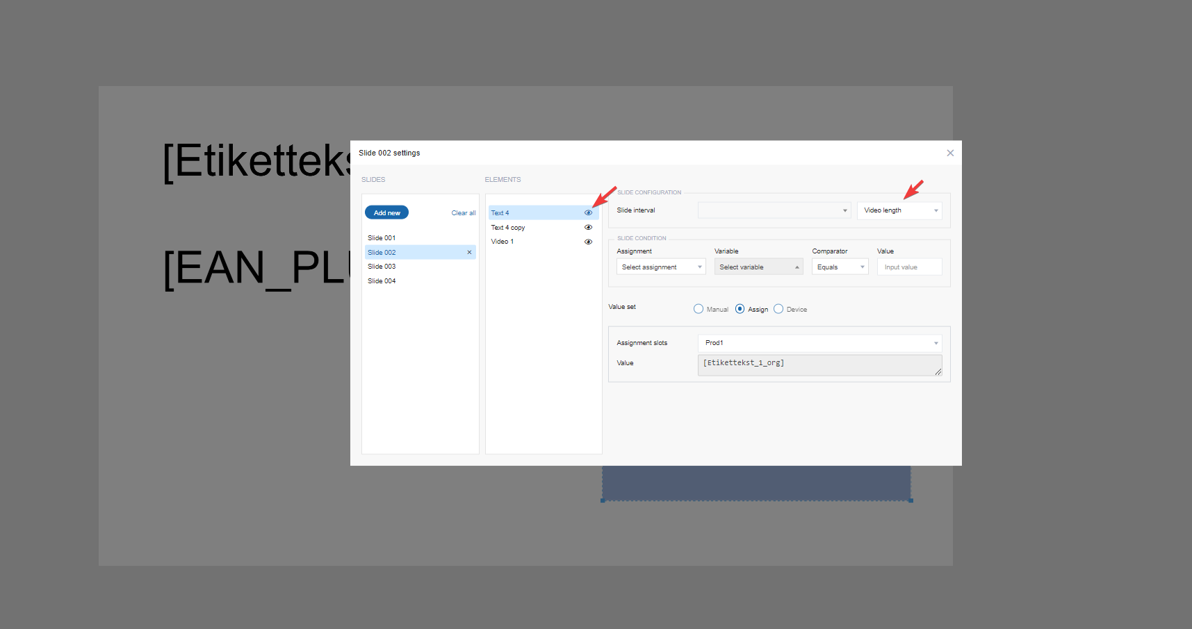
Slide interval: Change the interval. Interval can be fixed or a parameter value. The interval can be different from slide to slide.
Slide condition: Make a condition for the slide. E.g. only show the slide if Product2 is present.
Bottom right area: change the value upon change of slide. E.g. Slide1 is showing the value of [Etikettekst_1] of Product1. Therefore slide2 needs to be changed to Product2 in this example.
If an element condition is present this is shown at the bottom and this condition can also be changed.

Misc Info:


